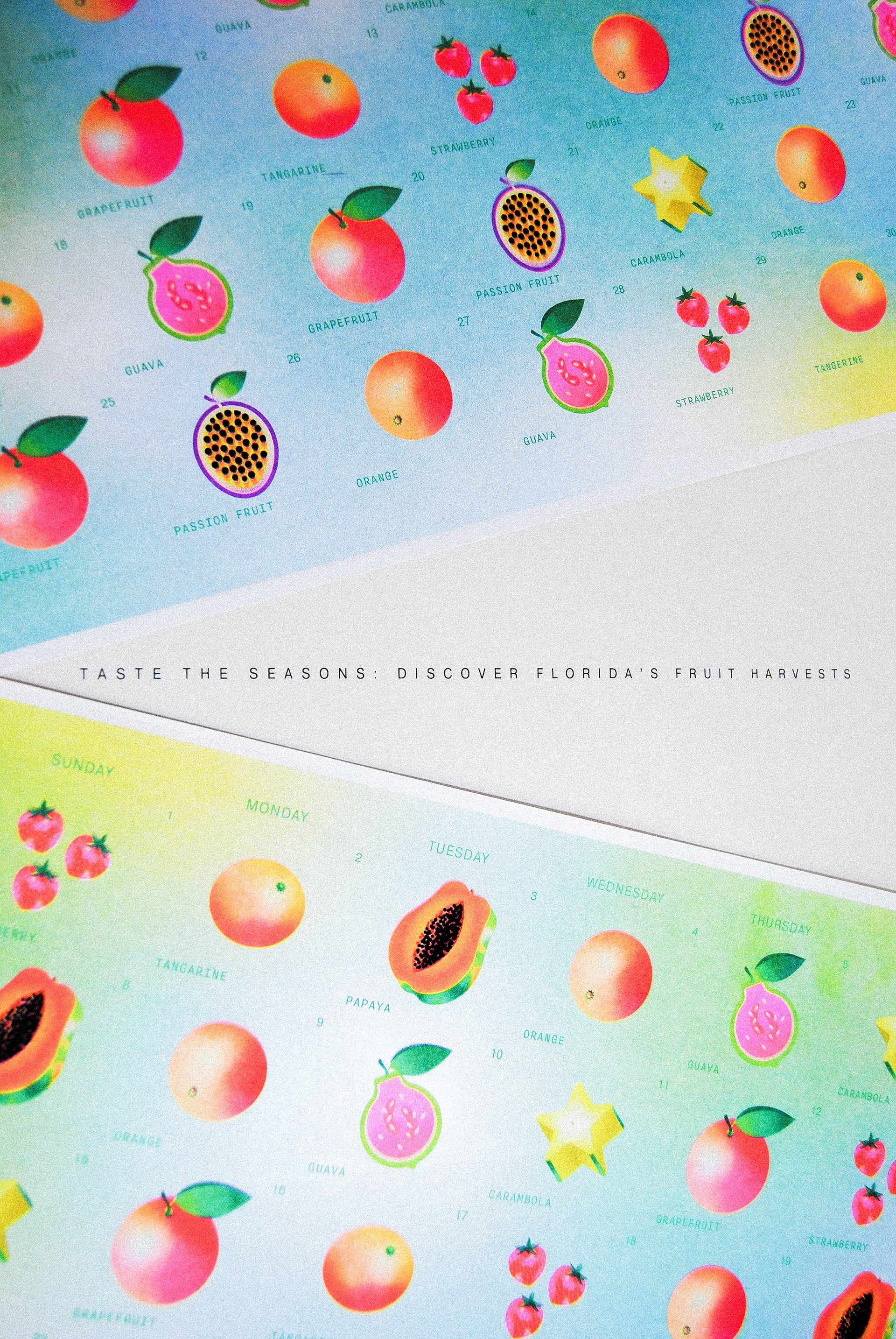
Taste the Seasons: Discover Florida's Fruit Harvests
An illustrative data visualization project mapping Florida’s seasonal fruit harvests and temperature shifts through participatory research, illustration, and risograph printing—designed to encourage attentive noticing of food, climate, and environmental systems. Please see my thesis document in my About page to read research further.
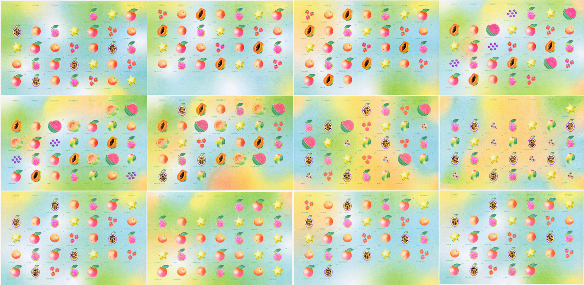
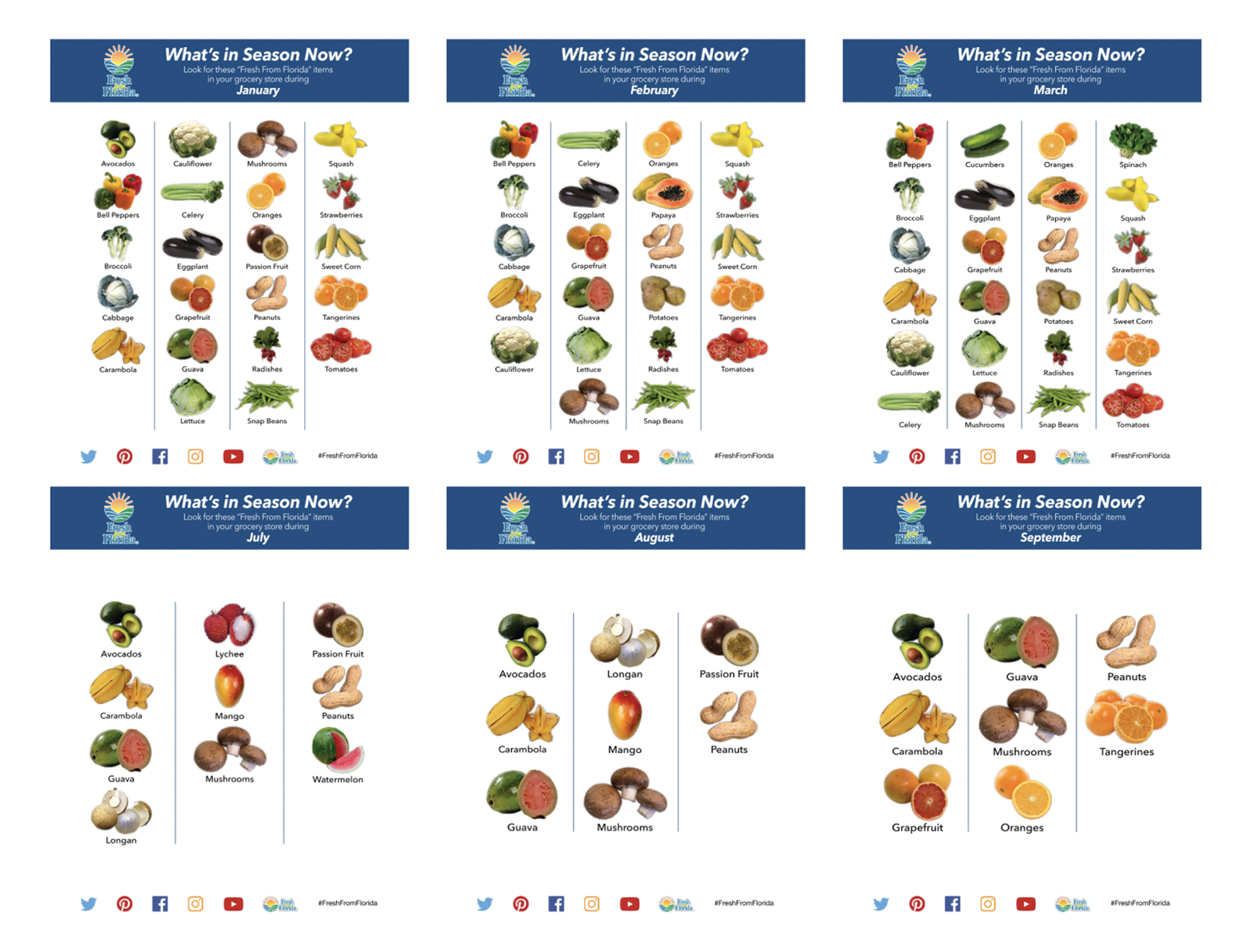
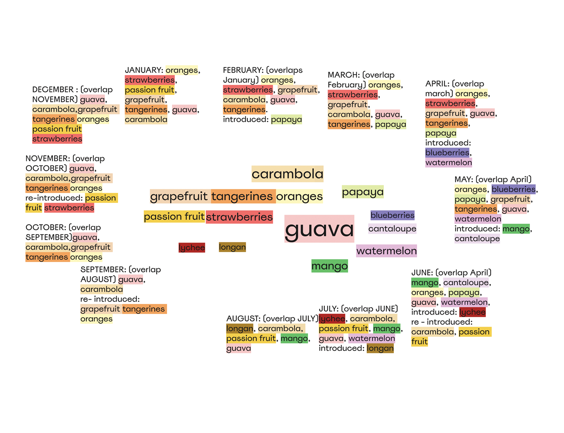
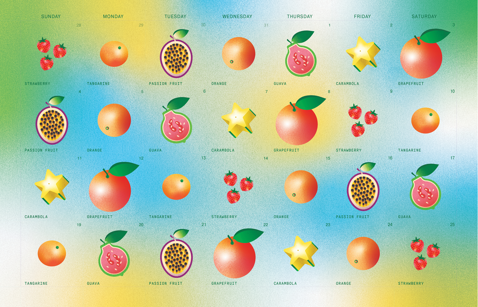
Developed in Gainesville, Florida, this project is grounded in place-based design research using University of Florida IFAS resources, including Buy Fresh From Florida, and conversations with faculty researchers. Seasonal crop data was translated into a twelve-month fruit calendar that visualizes local harvest cycles alongside gradual temperature changes, embedding environmental information within an accessible, everyday format.
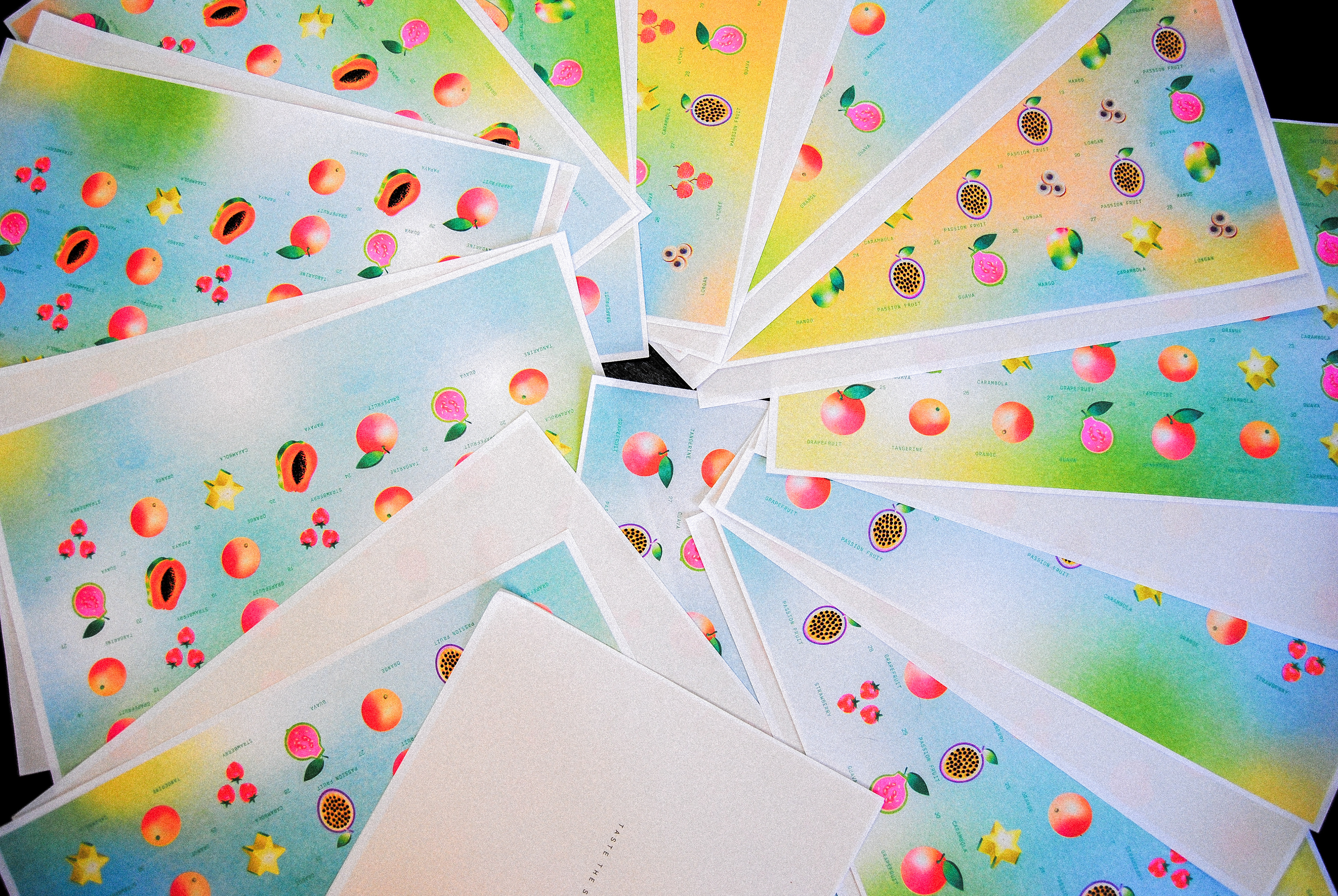
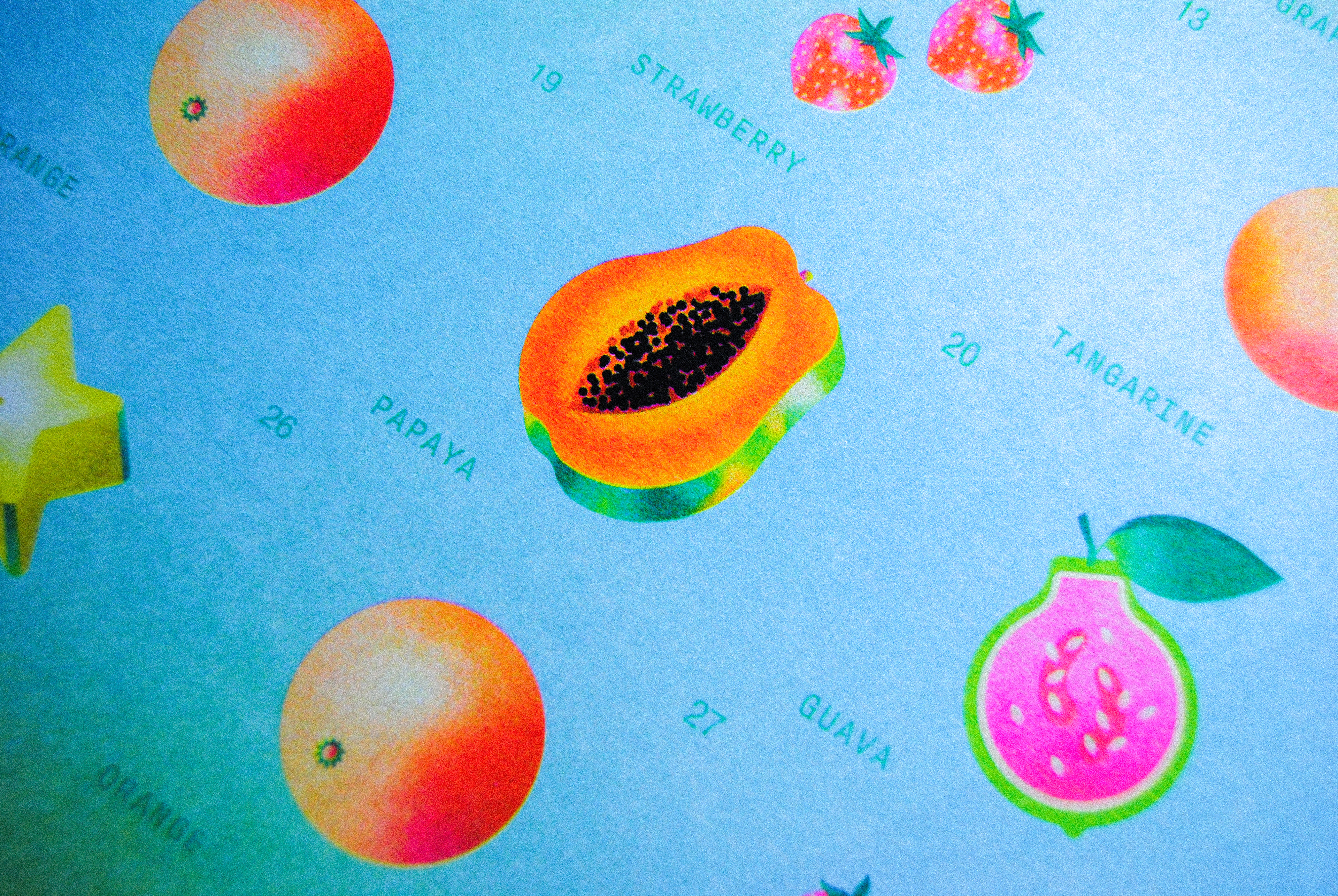
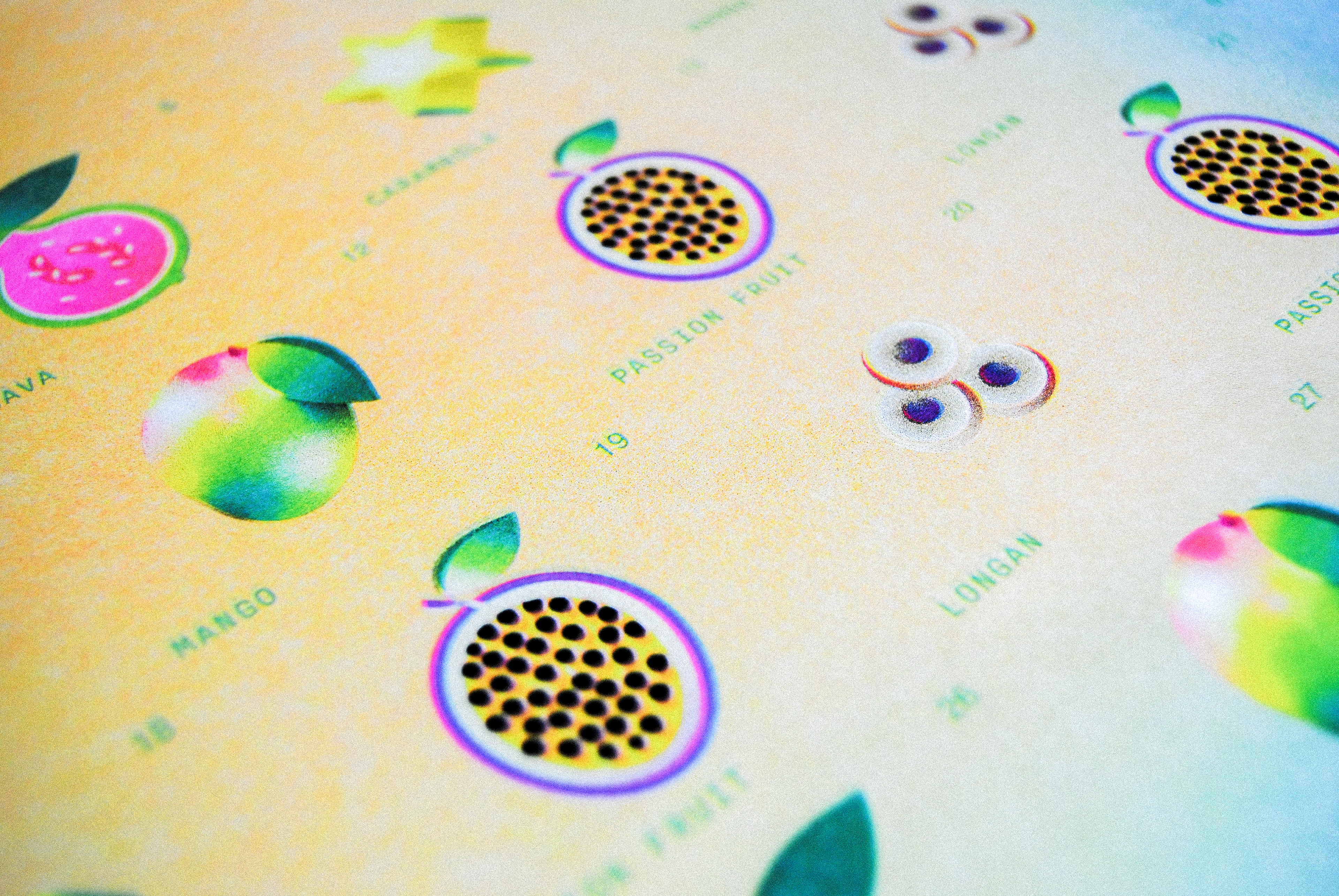
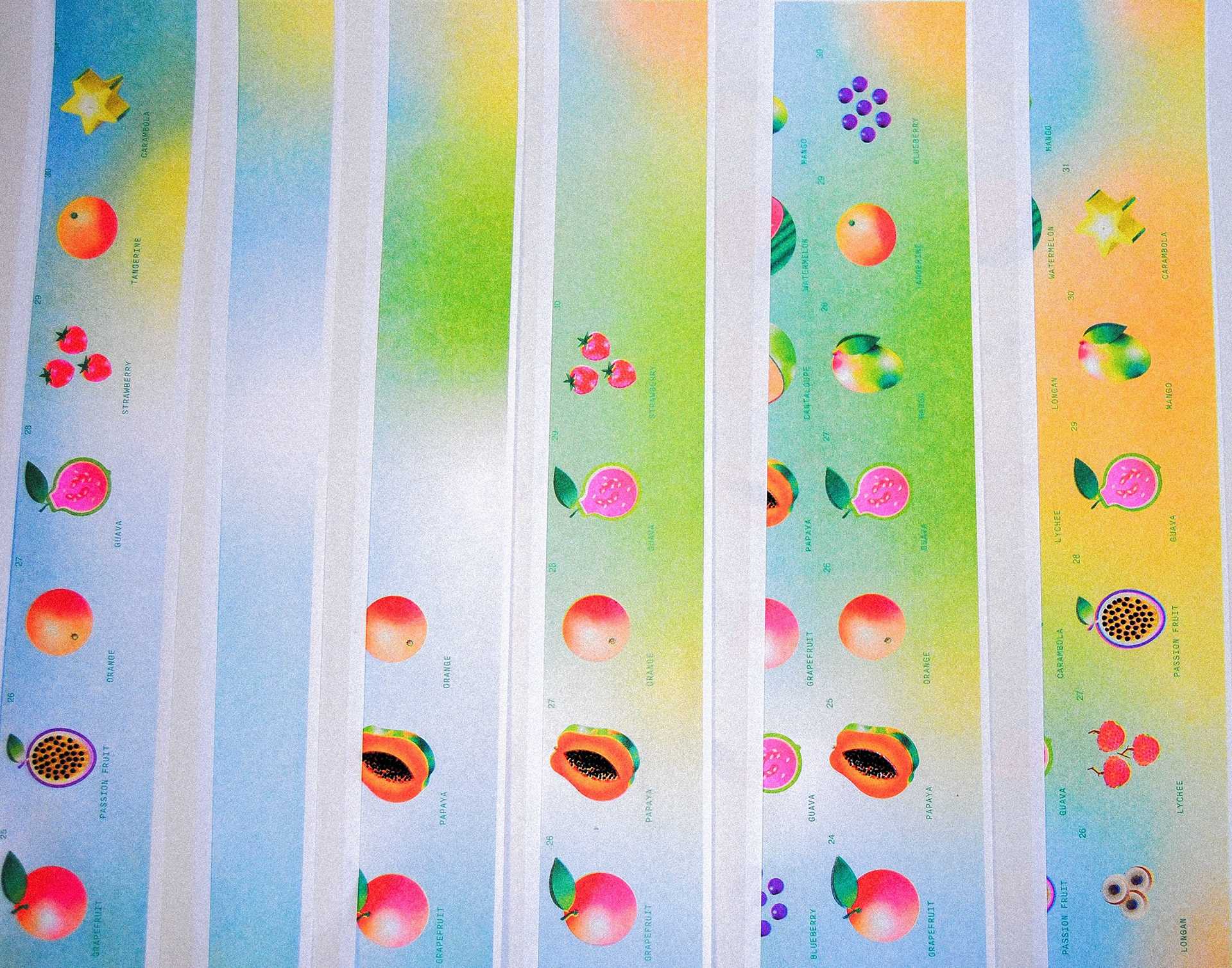
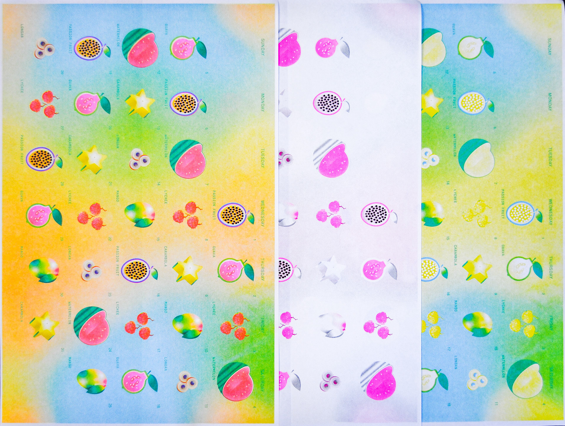
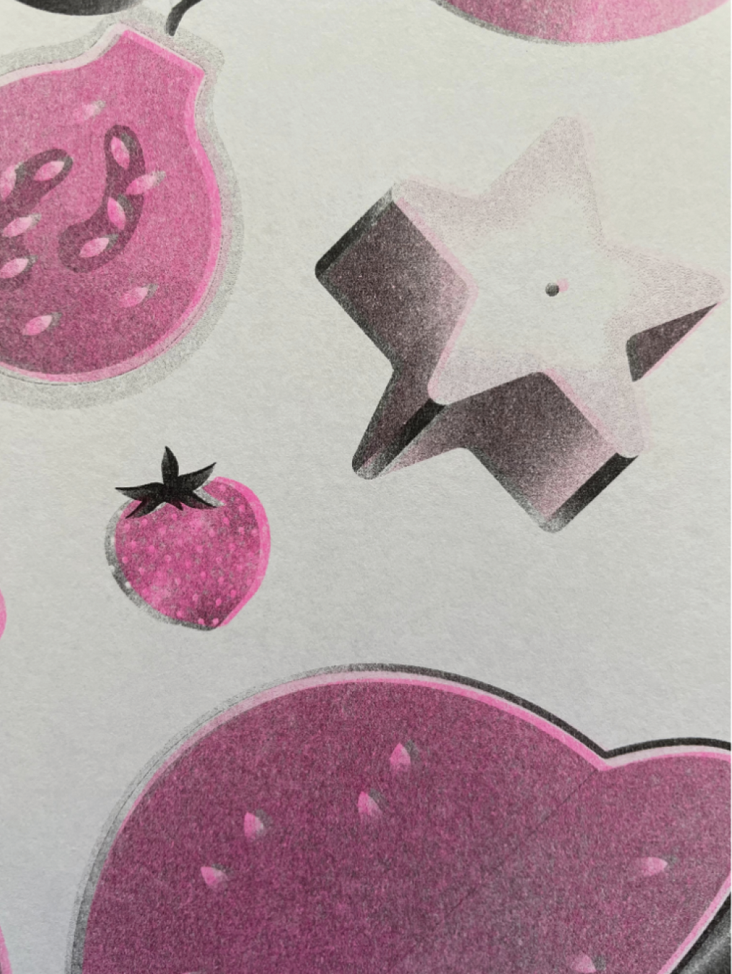
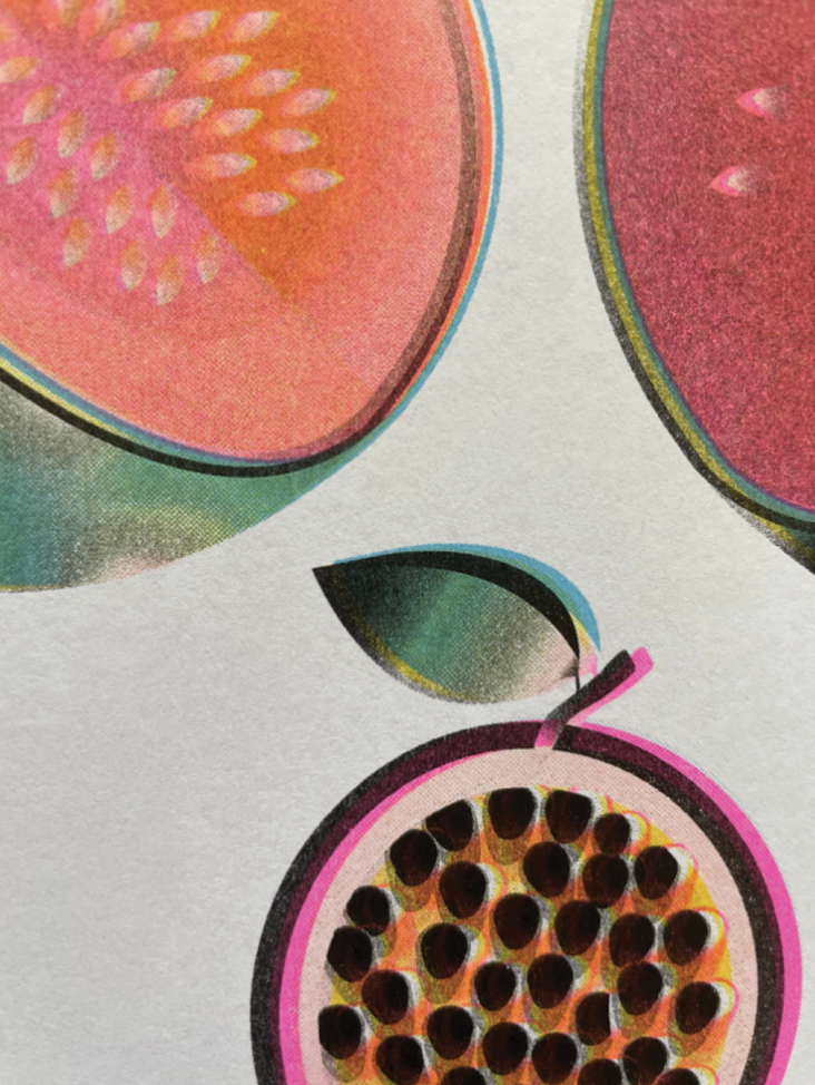
The calendar was produced using a four-color risograph process (cyan, yellow, magenta, and black), embracing the medium’s layered textures, misregistration, and material variability. These handmade qualities mirror the project’s conceptual focus on interdependence—emphasizing that food and environmental systems, like the printed surface itself, are layered, relational, and shaped by process rather than flat or neutral.
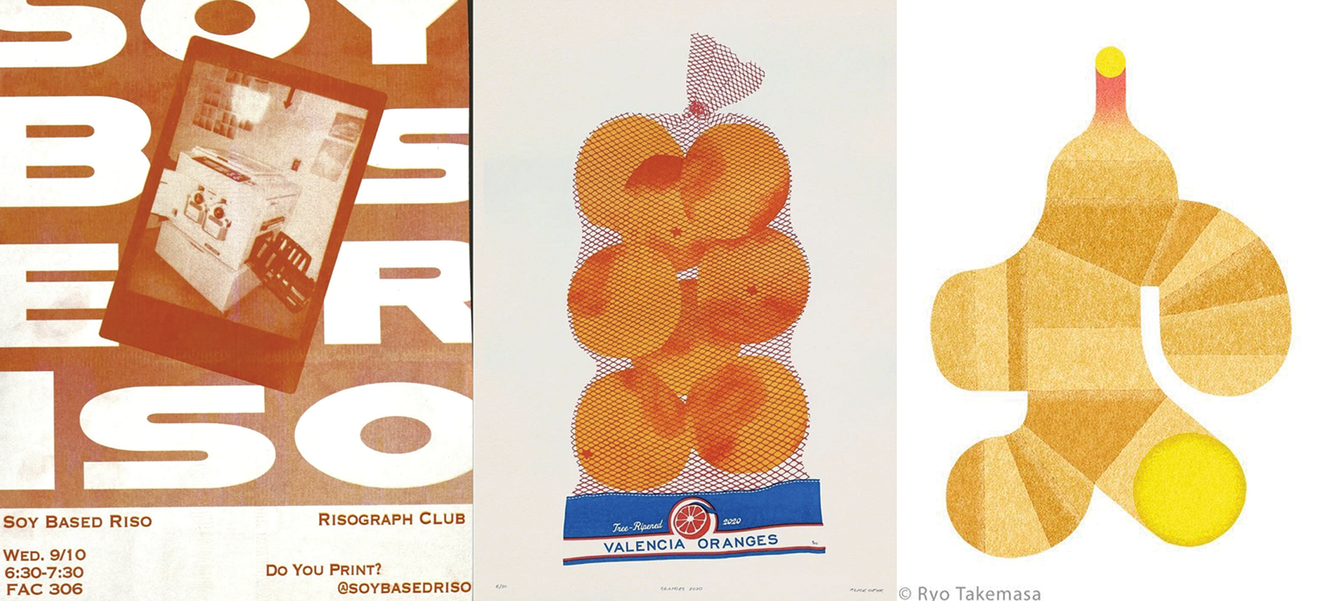
Inspirations include the graphic clarity and playful systems of Ryota Kemas and Alice Oehr, alongside human-centered data visualization (Giorgia Lupi) and material-led uses of color as meaning (Sister Corita Kent).
Acknowledgement: This project was developed under the guidance of Eury Kim, my Thesis Chair and professor at the University of Florida.
Seasonal interconnections · Tangible Systems · Food Interdependence · Research
Final Risograph Prints — 12 Months, Details Process & Color Gradual Temperature Change
Process — Research & Organization
In my conversation with Dr. Campbell during my research, I was able to find multiple documents showing produce in season, month by month in Florida. From there a pattern emerged. Certain fruits kept reappearing season after season, and I began color-coding the data to make sense of it.
This process allowed me to see not just when they appeared, but how they moved through the year and what that rhythm revealed about the broader food system they are part of.
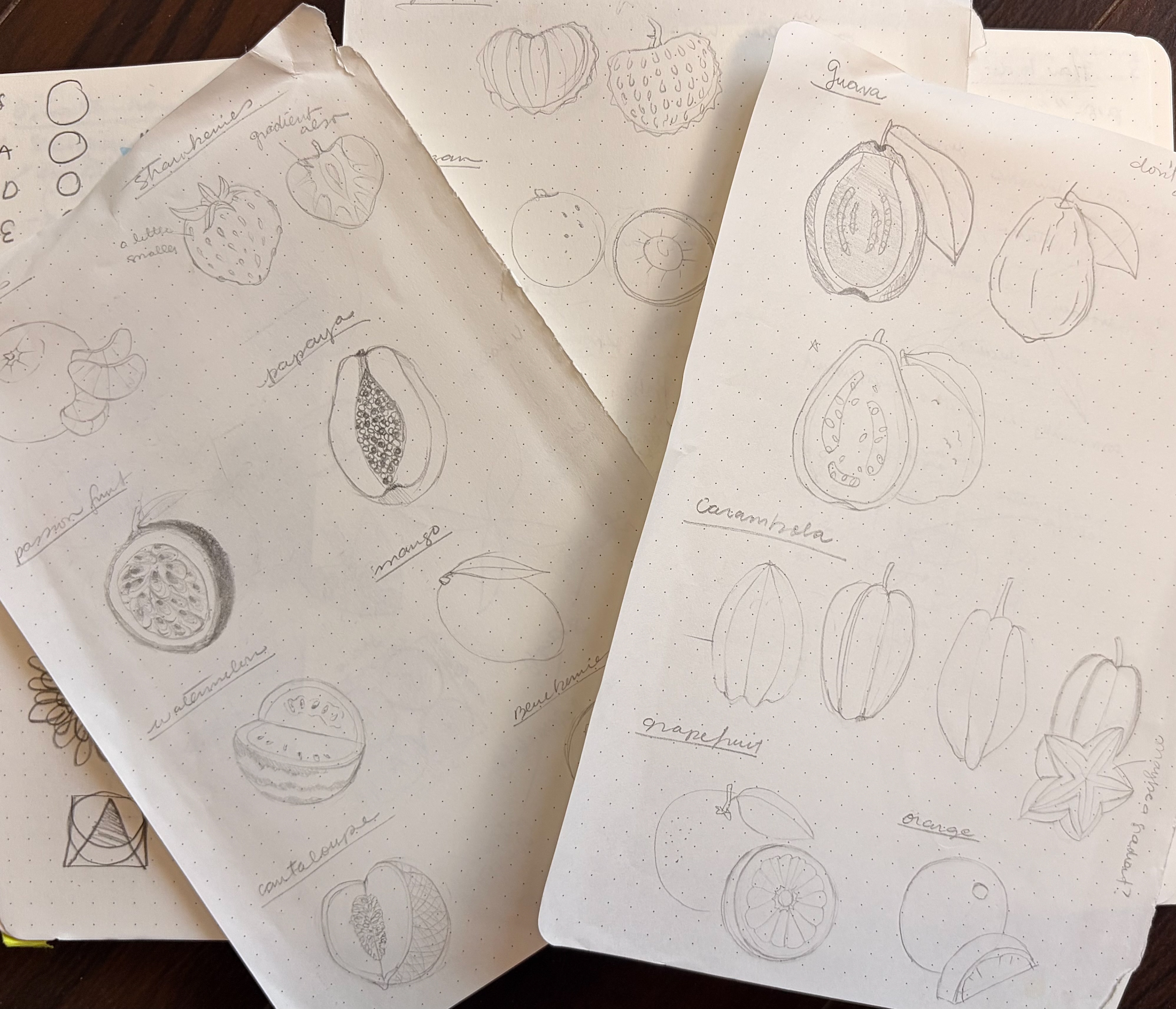
Process — Inspiration & Sketches
Becoming aware of the Risograph club at UF while teaching as a graduate assistant sparked an interest in exploring the process myself. I was drawn to the way layers build on each other, leaving traces of how they were made. These handmade qualities supported the project’s conceptual focus on interdependence—emphasizing that food and environmental systems, like the printed surface itself, are layered, relational, and shaped by process rather than flat or neutral. As an illustrator, I turned to visual references, drawing inspiration from the colorful, playful compositions and tactile printed textures of Alice Oehr and Ryota Takemasa.
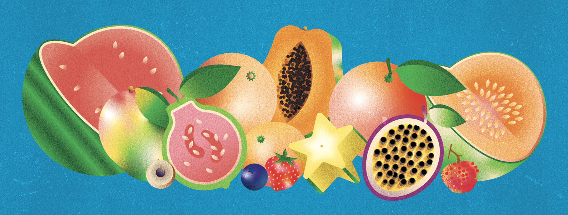
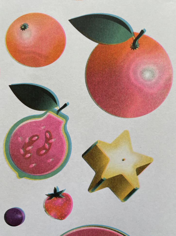
Final Digital Illustrations
Process — Riso Print + 12 Months
Testing color layering—a four-color risograph process.
I developed the final design of the calendar, incorporating background elements that reflect the temperatures observed throughout each month as a final layer to strengthen the concept. This approach emphasized how food and environmental systems—like the printer surface itself—are layered, relational, and continuously shaped. Using this method, I produced prints for all twelve months.
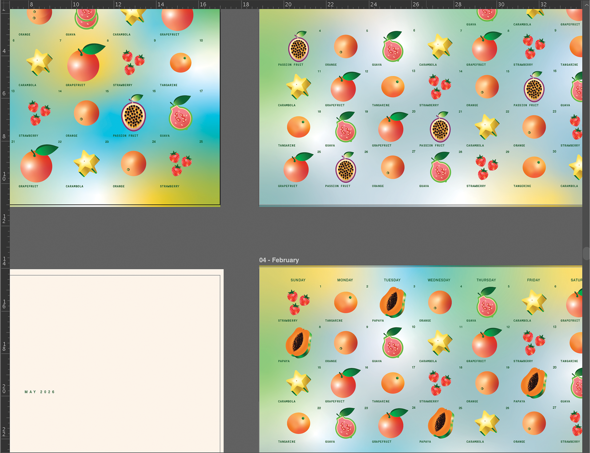
Final Risograph Prints — 12 Months January to December 2026