Role: Instructor
Typography I
This foundational typography course introduces students to the expressive and communicative potential of letterforms as visual systems. Through project-based learning, students explore how type shapes meaning across print and screen contexts, emphasizing hands-on experimentation, research, and iteration over theory in isolation.
Students engage typography through a sequence of assignments that included exercises drawing the alphabet through different mediums, projects involving lettermark design for an imaginary local business, typographic packaging remixes, and a social media carousel introducing a design hero. These projects guide students through gathering visual references, building typographic voices, developing hierarchy, and considering scale, motion, and context. Research and concept development—such as mind mapping, mood boards, type specimen studies, narrative storyboards, and animation—support each project, reinforcing typography as both form and language.
Collectively, the course establishes a foundational understanding of typographic history, terminology, and design principles while encouraging students to manipulate letterforms to construct identity, narrative, and tone. Instruction is grounded in a pedagogical approach that views teaching as an evolving practice, allowing methods, assignments, and insights to adapt through dialogue, experimentation, and reflection in the classroom.
Acknowledgement: This course was originally developed by Dr. Dori Griffin, professor at the University of Florida. In my role as instructor, I taught the course while actively adapting and evolving the curriculum, drawing on my own pedagogical practice, research, and classroom experimentation.
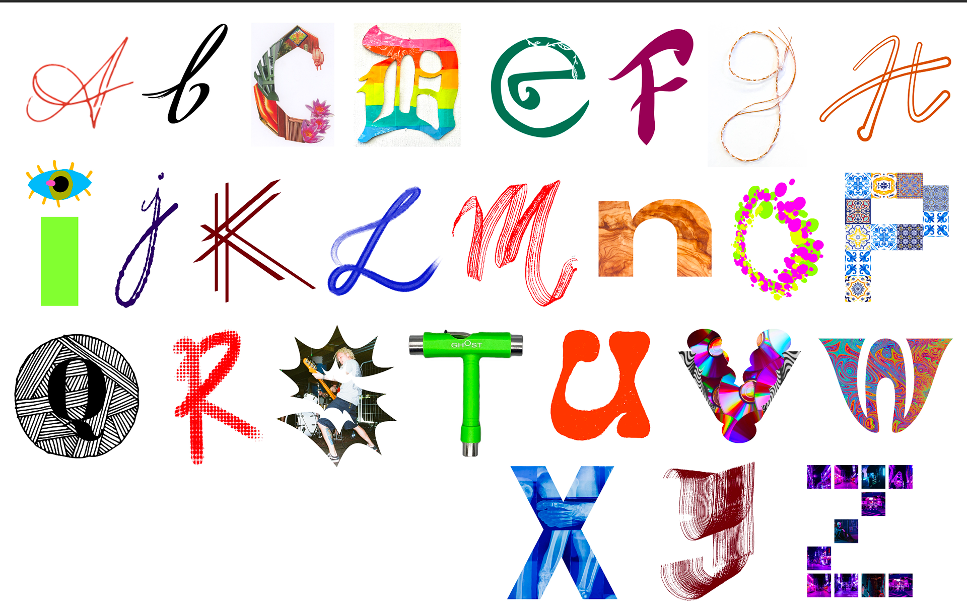
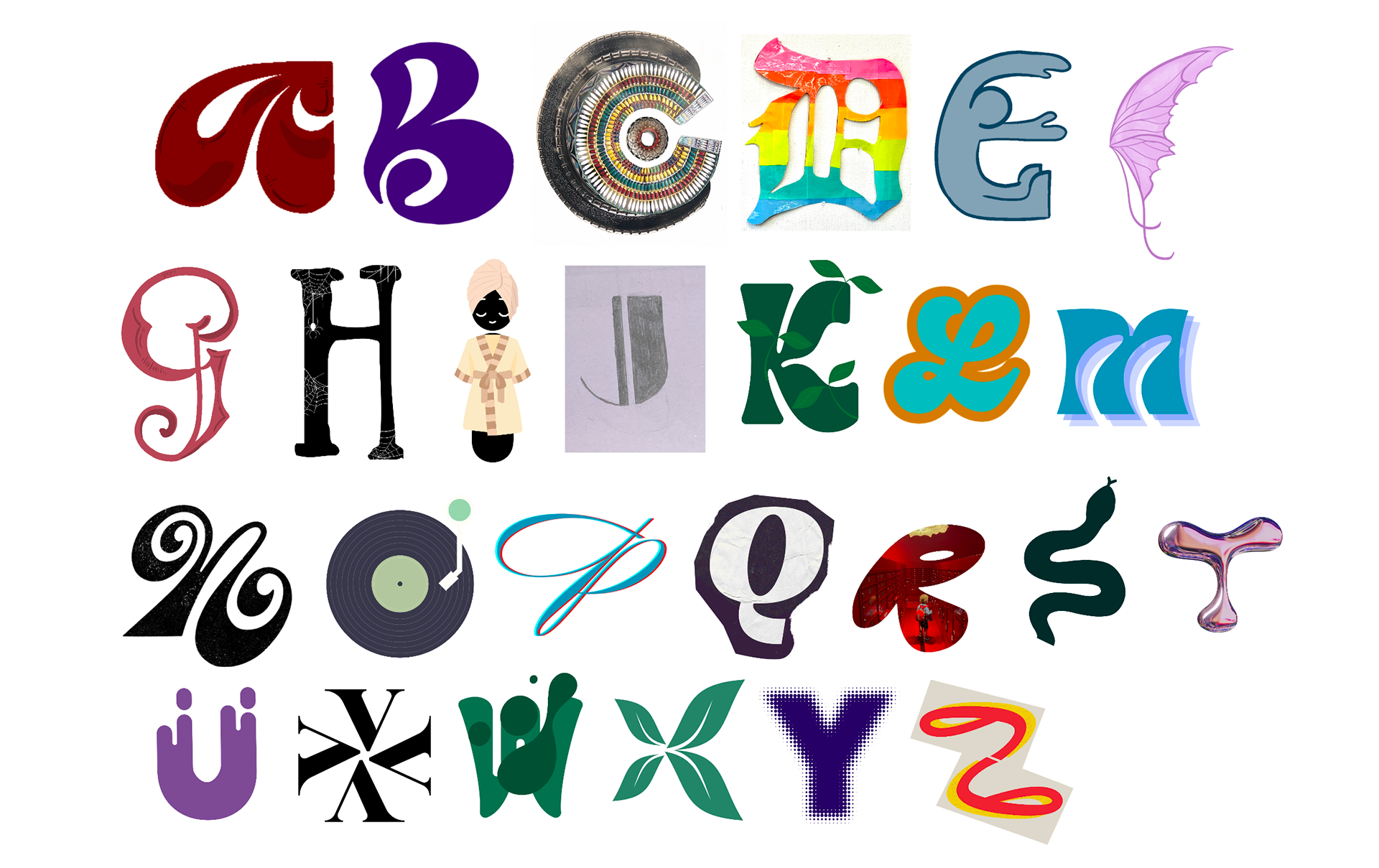
Daily Drop Cap
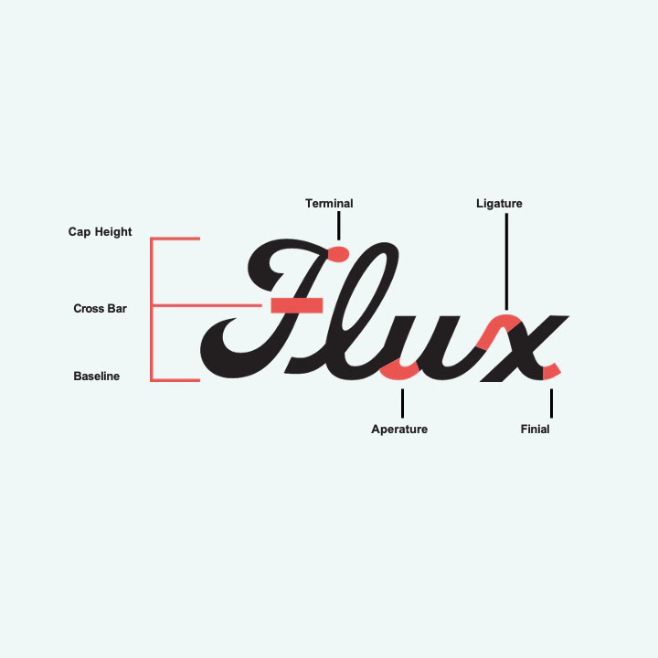
A daily typographic exercise in which students design one drop cap per class day to explore letterform anatomy through rapid sketching, iteration, and making. The project builds fluency, efficiency, code signing with others while reinforcing typographic problem-solving as an everyday design practice.
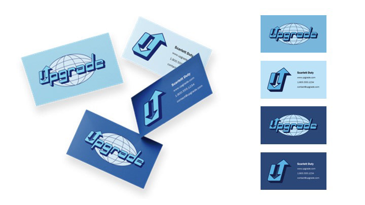
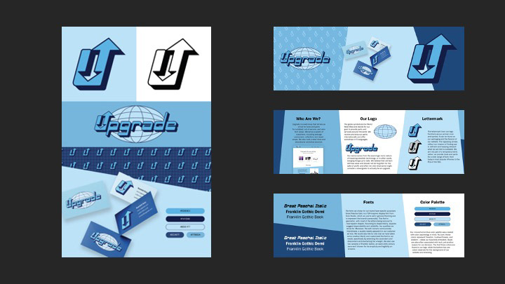
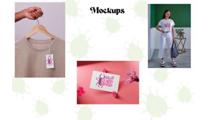
Local Lettermark
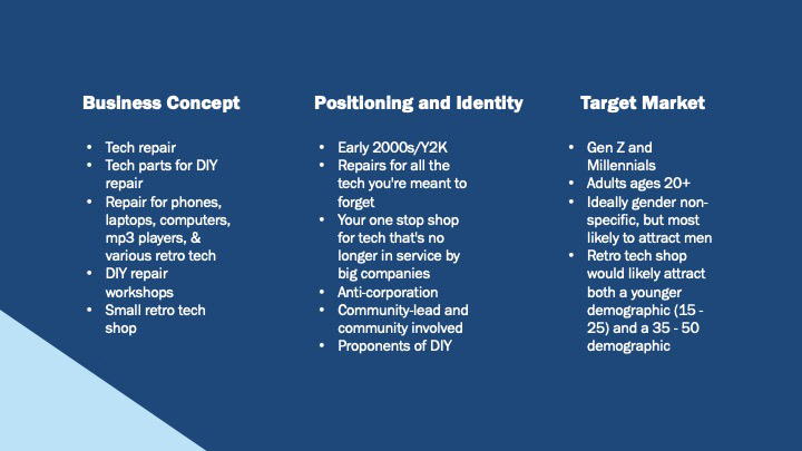
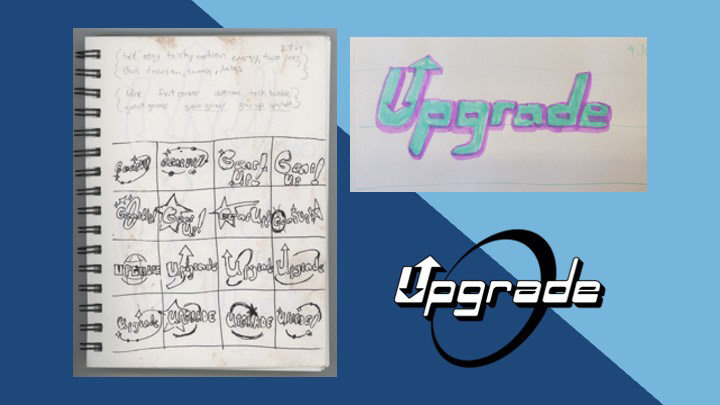
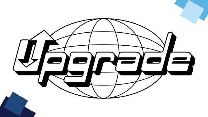
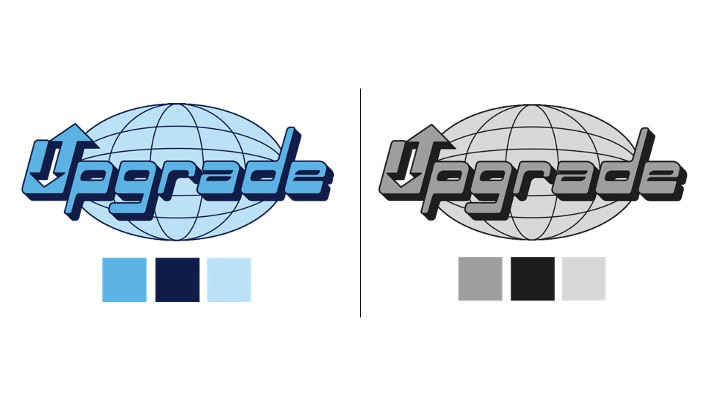
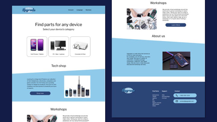
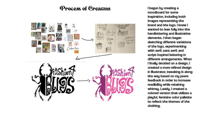
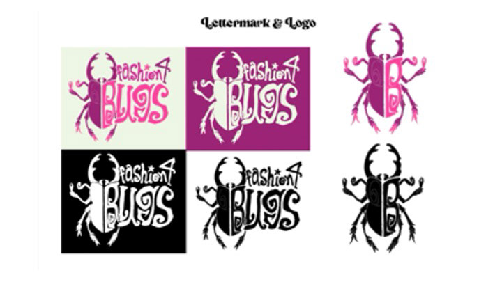
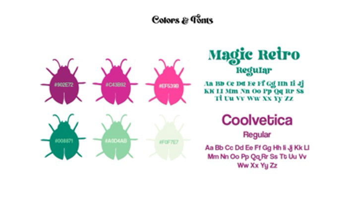
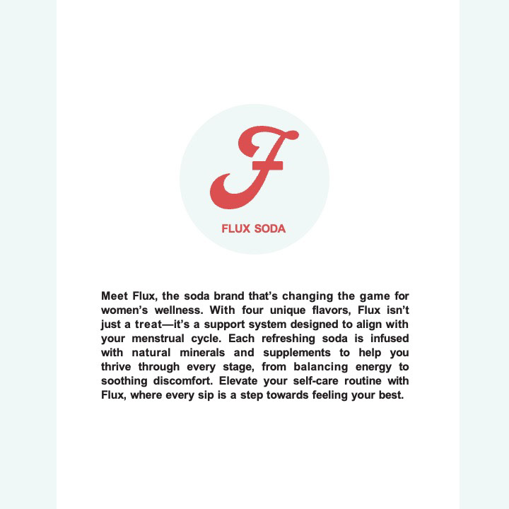
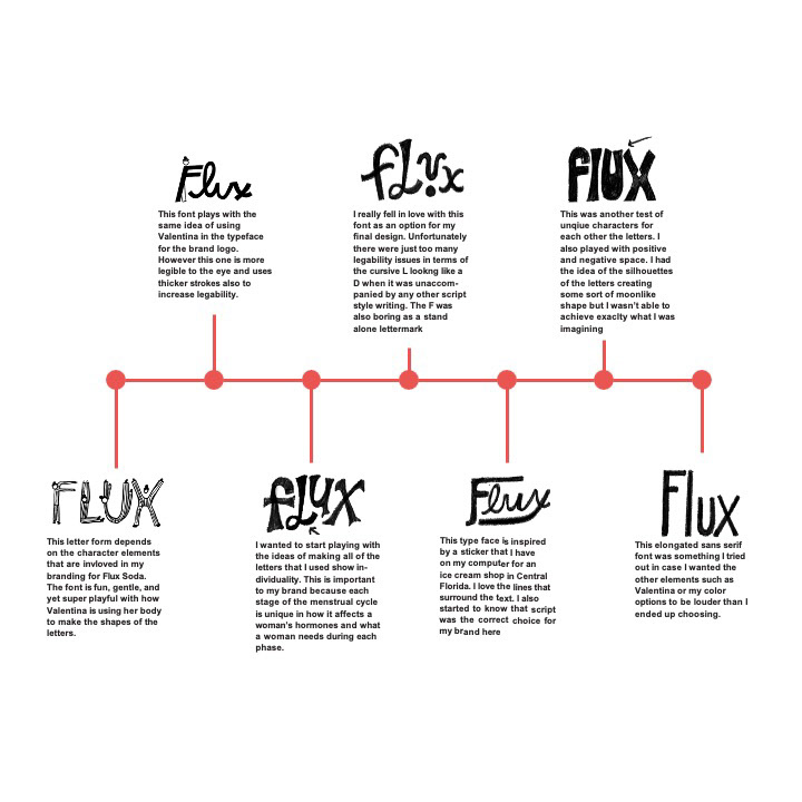
This project explores how letterforms can shape identity by guiding students from typographic research to the creation of a lettermark for an imagined local business. Emphasis is placed on visual consistency, expressive type, and adapting a design across formats and scales.
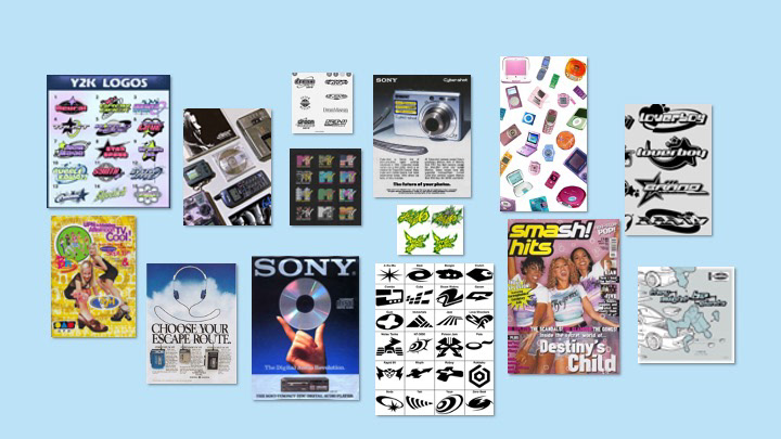


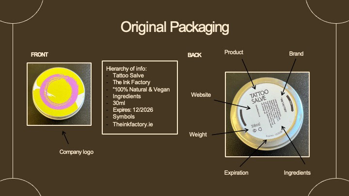
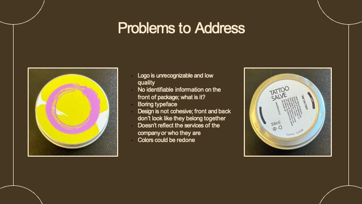
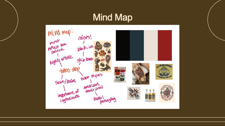
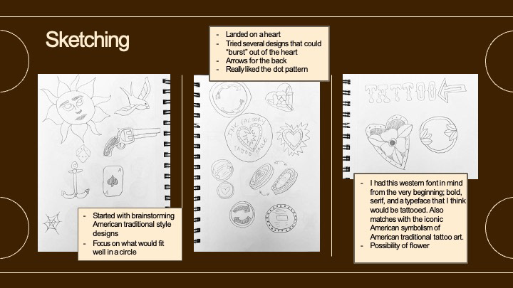
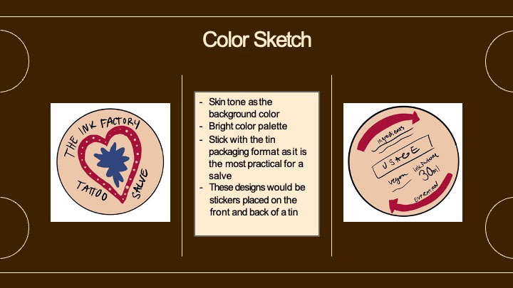
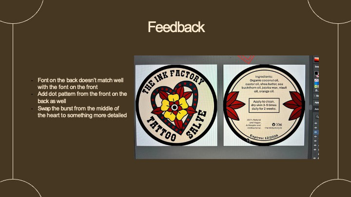
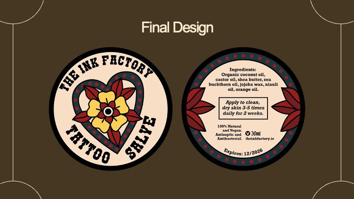
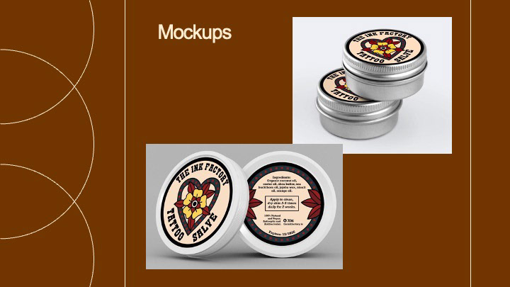
Package Re-mix
Students analyze an existing low-cost product and reinterpret its packaging using only typography and the original text. Through constraint-based design, the project explores rebranding as a form of audience redefinition.
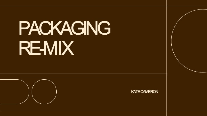

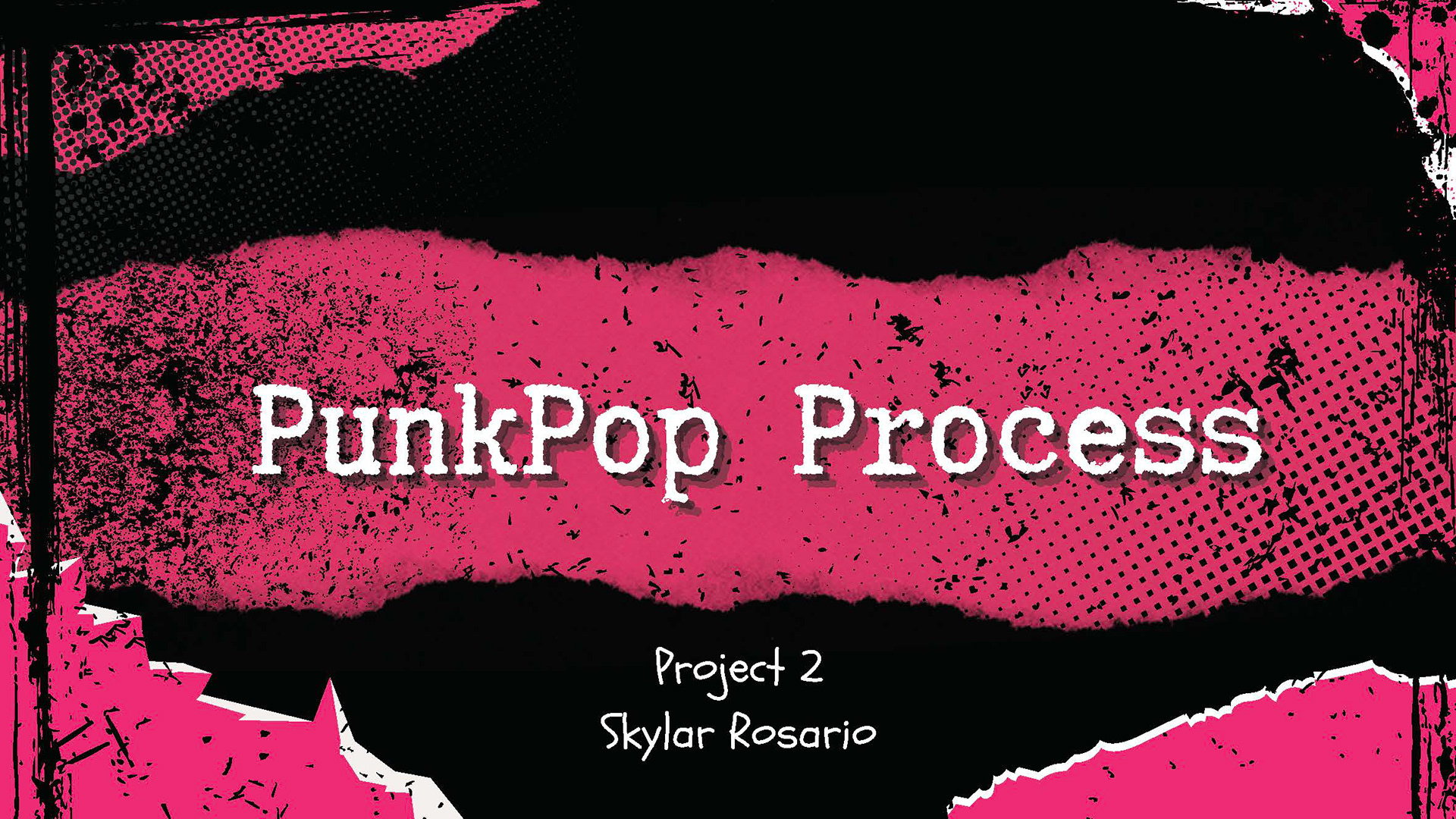
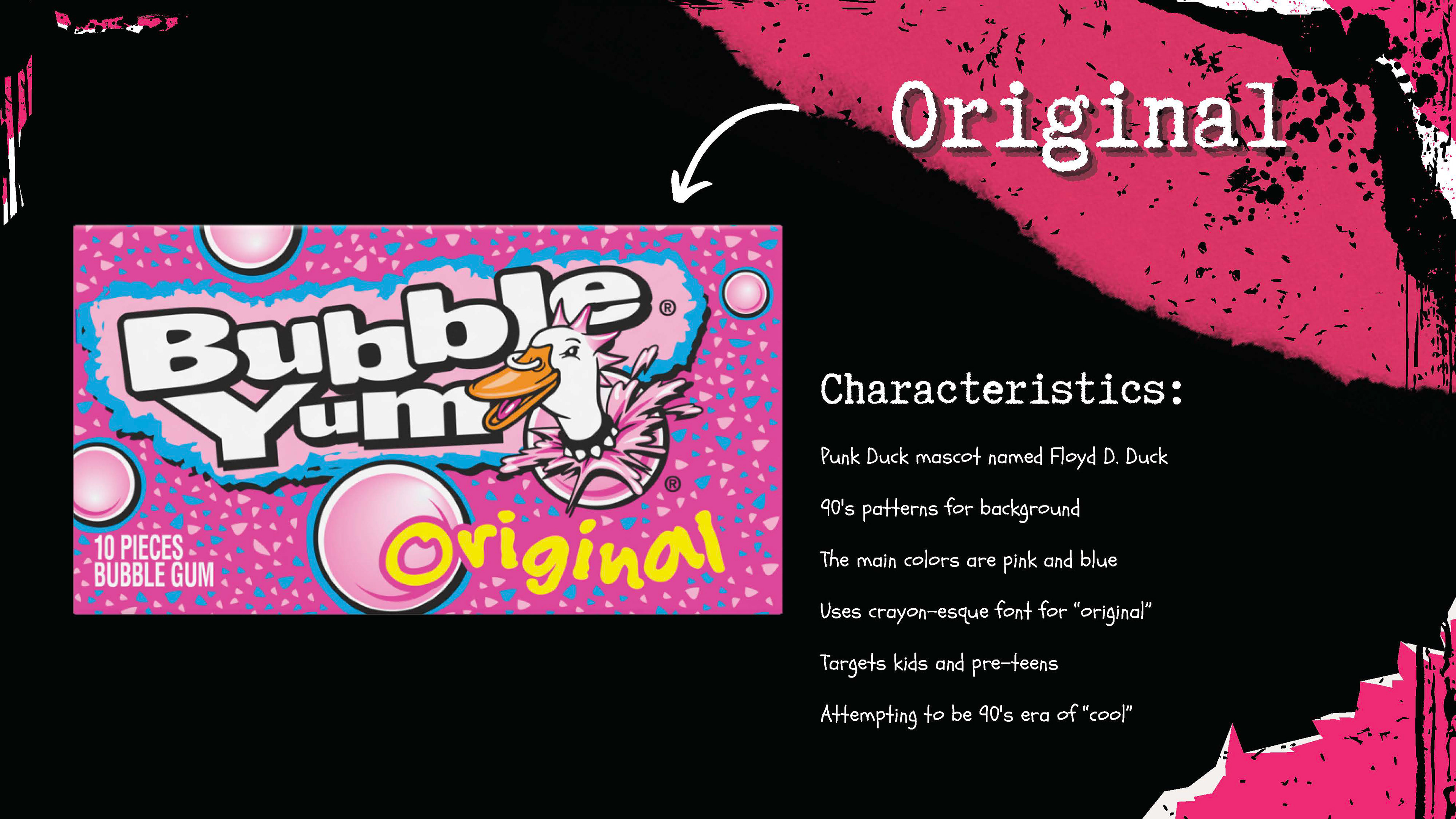
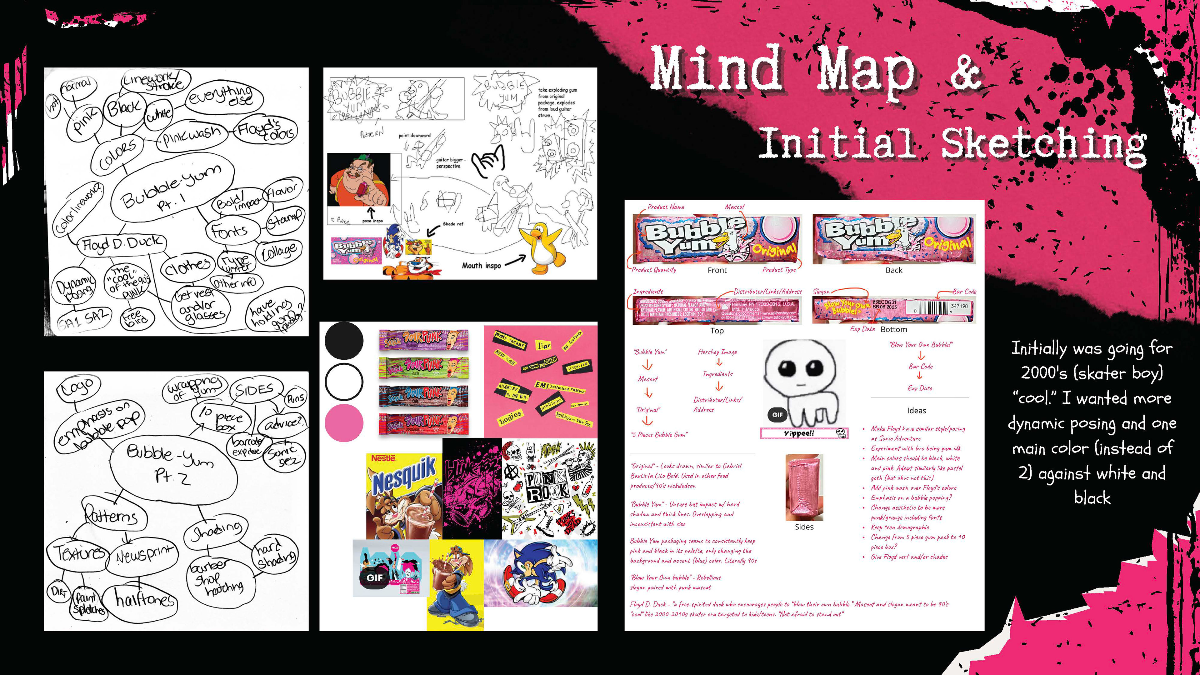
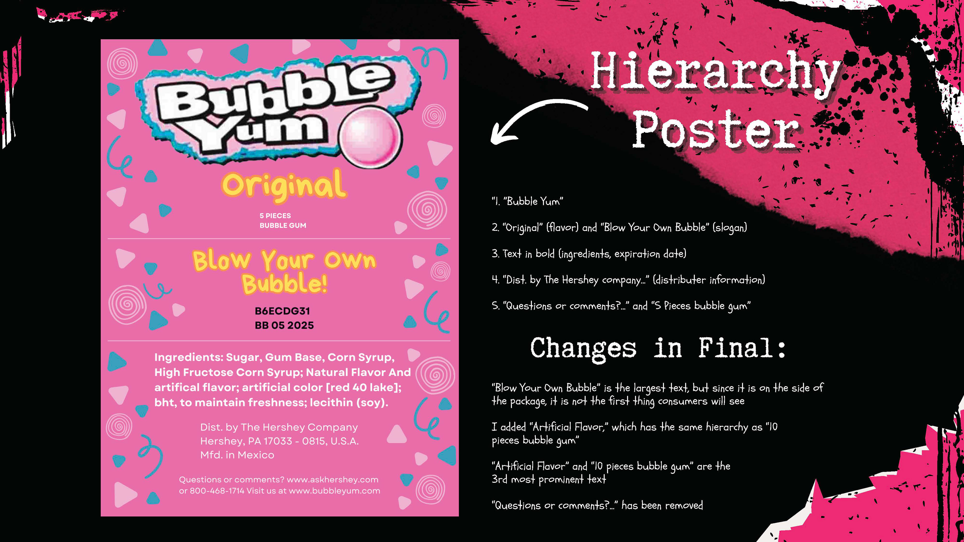
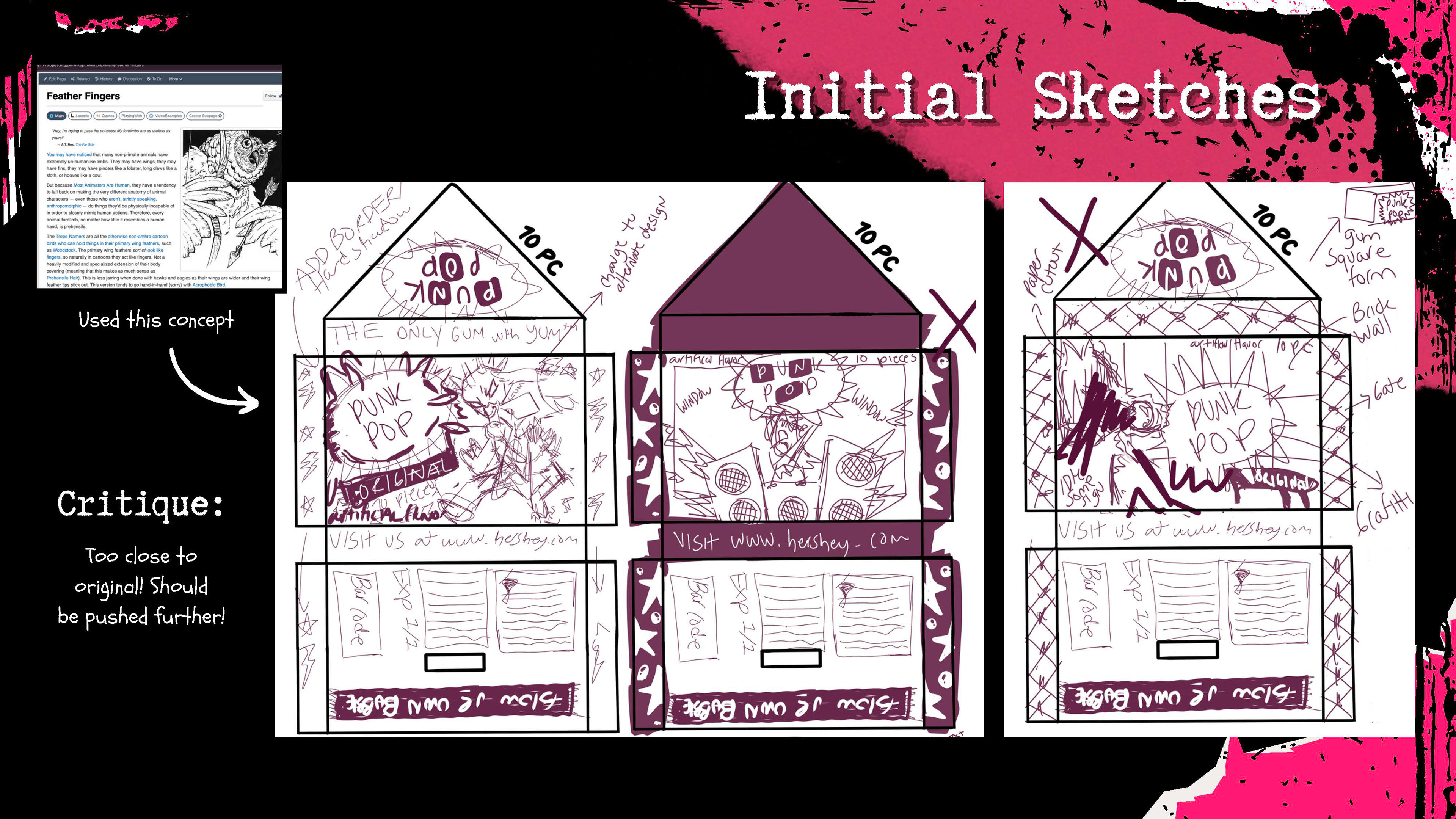
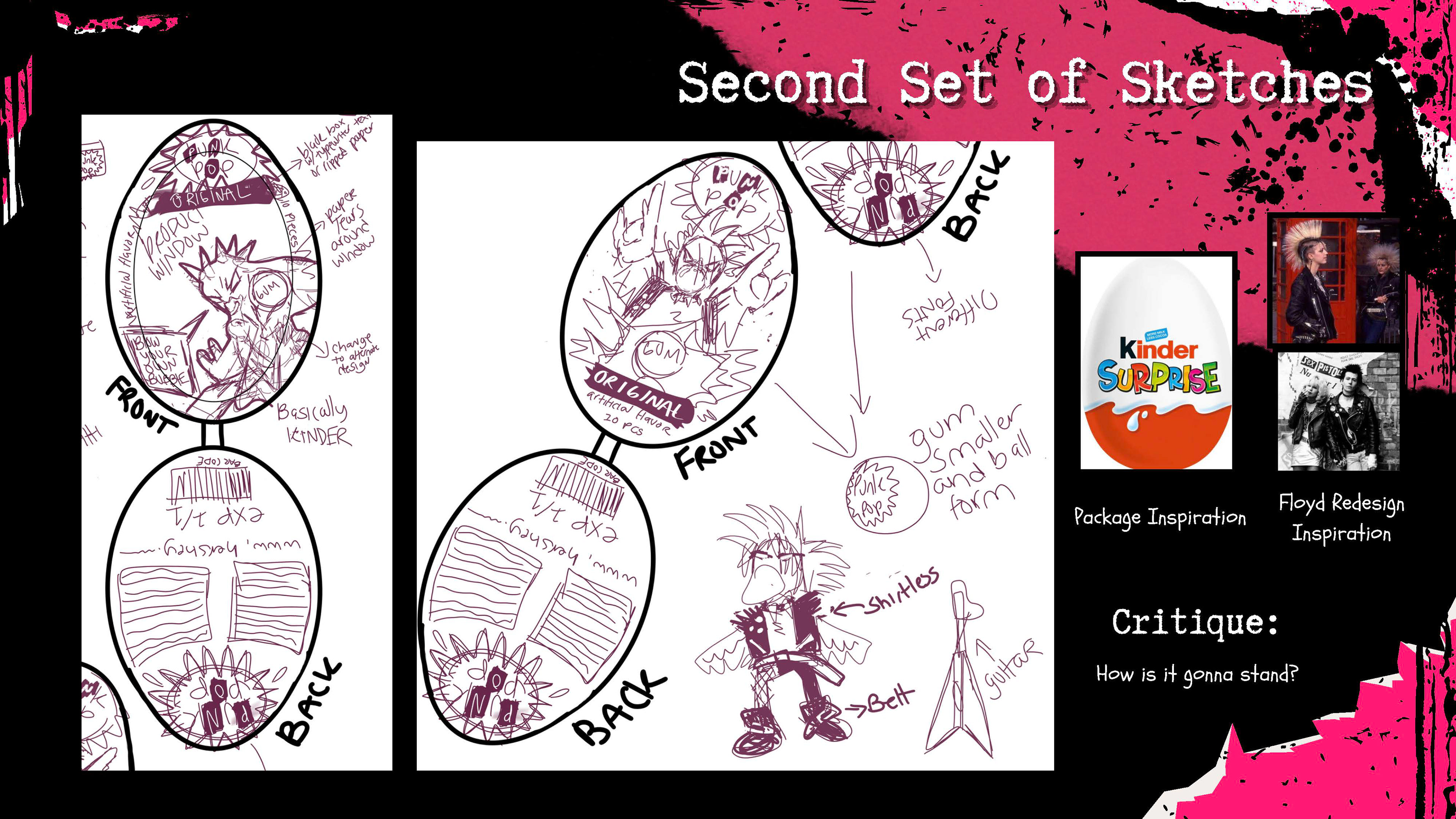
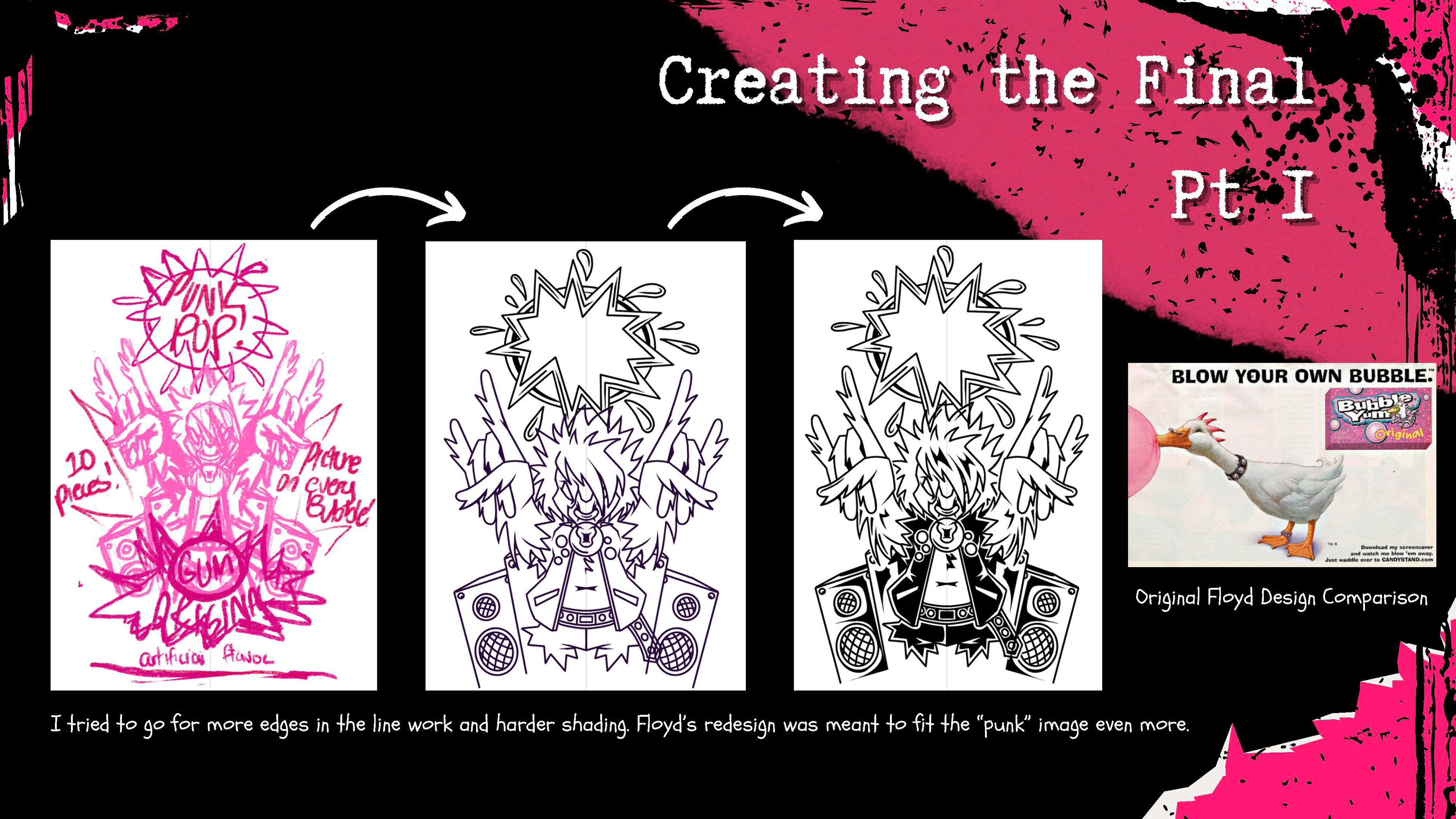
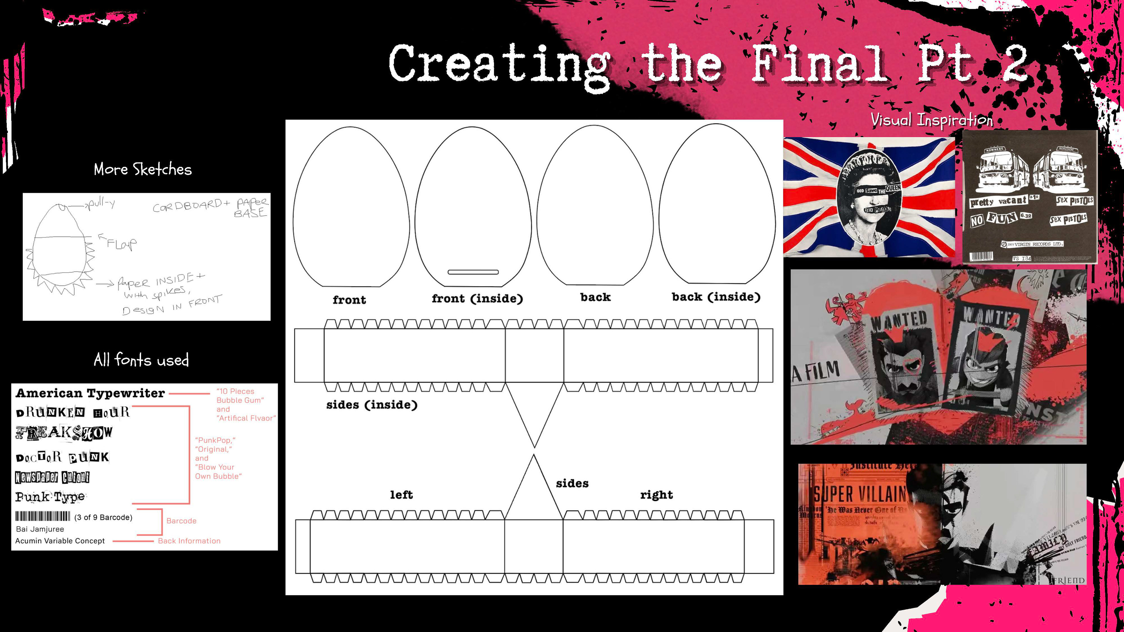
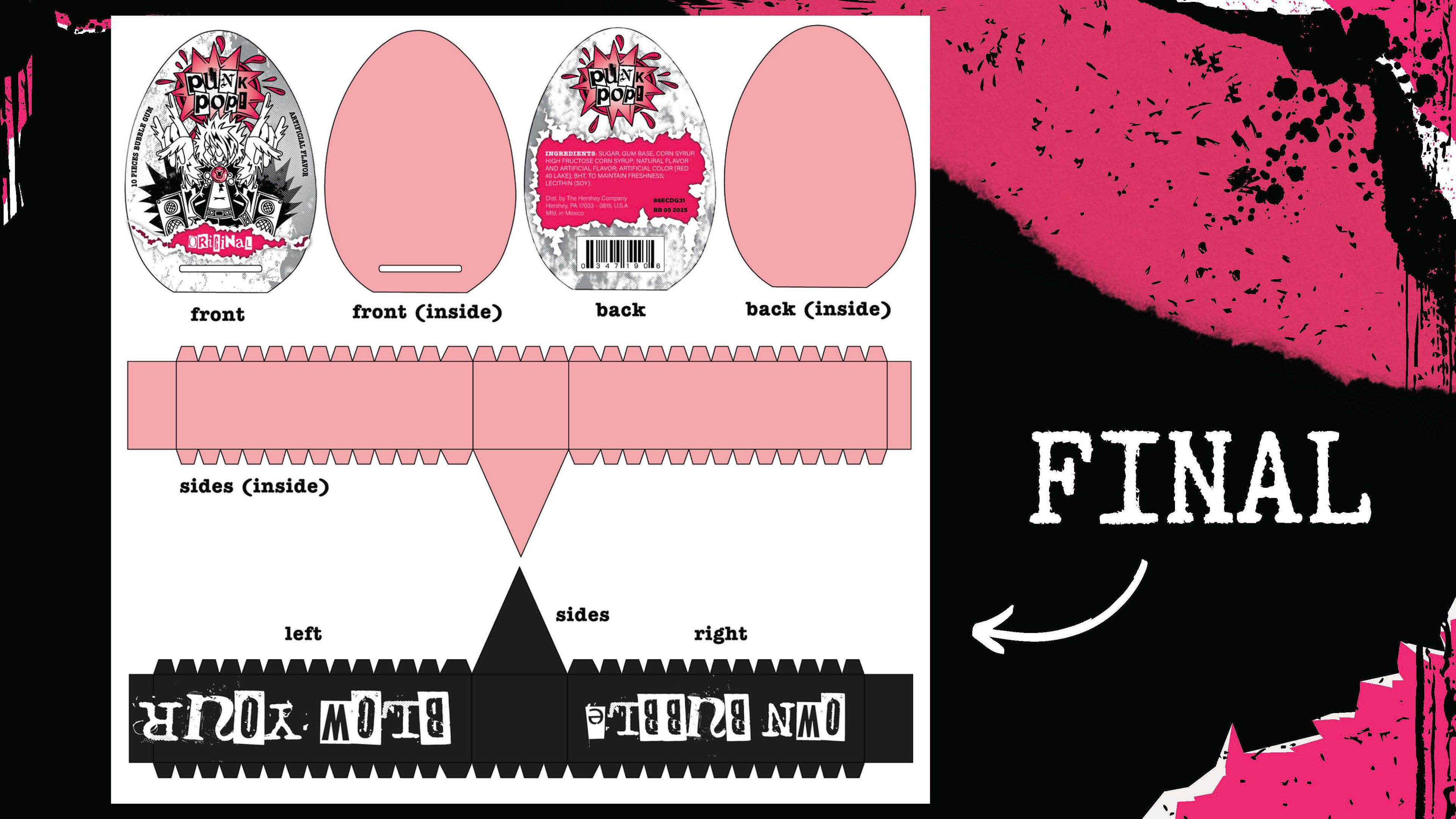
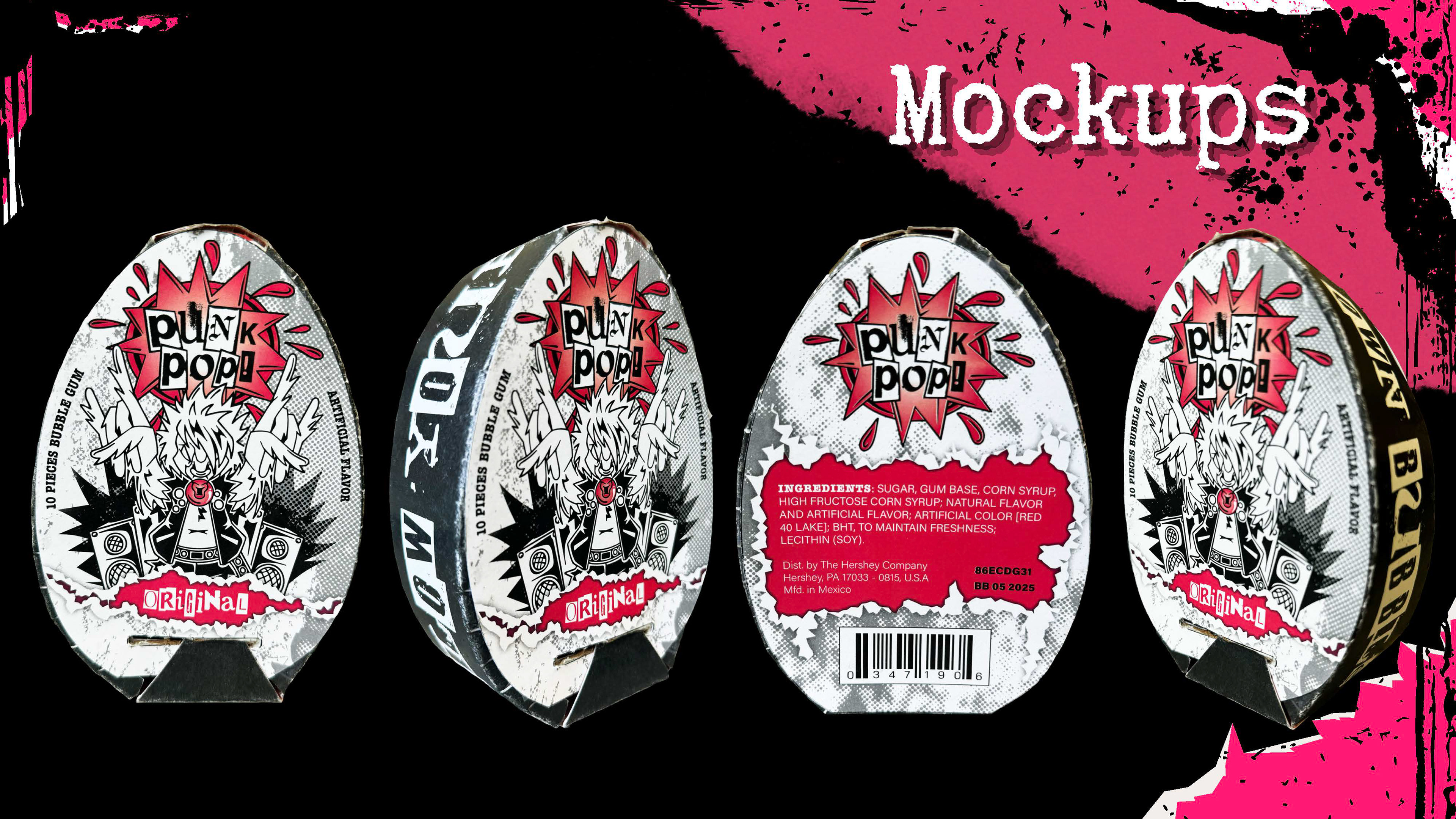
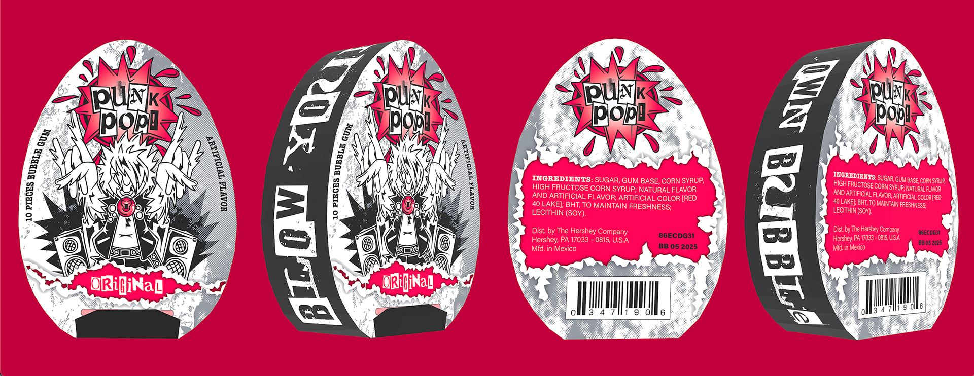
Punk-Pop was featured in Ligature 34, UF's annual juried graphic design exhibition
Design Heroes
Students design a typographic social media carousel introducing a chosen design hero to a community of designers. The project emphasizes narrative, hierarchy, motion, and clarity within the constraints of mobile-first platforms.